When I worked at Columbia University’s art and architecture library designed by Beaux Arts superstar Charles McKim, if the university wanted to expand, the only place to go was down. Literally, they had to dig. And they did.
Adding basement space is horribly expensive and complicated, and it’s hardly “sexy” as far as architecture goes.
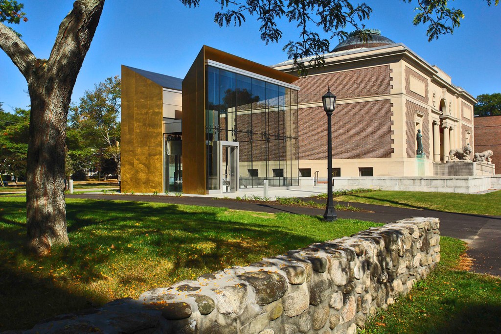
That was the task put to Machado and Silvetti Associates for the Bowdoin College Museum of Art. They expanded a free-standing McKim-designed architectural gem by focusing on basement space. On top of that, they had to create an entrance that would welcome both the campus community and the public, not an easy task for a building on a quad-oriented campus.
I had been pretty cool on the $20.8 million renovation completed in 2007. The entrance logic followed Pei Cobb Freed & Partners’ glass pyramid at the Louvre. (Cobb, by the way, is Henry Cobb who lives in Maine and designed the Portland Museum of Art.) Bowdoin traded a grand staircase leading into an even grander dome for a relatively small and slick glass structure that succinctly solved access issues such as elevators and so on. My primary complaint had been the basement-like feel of the underground foyer.
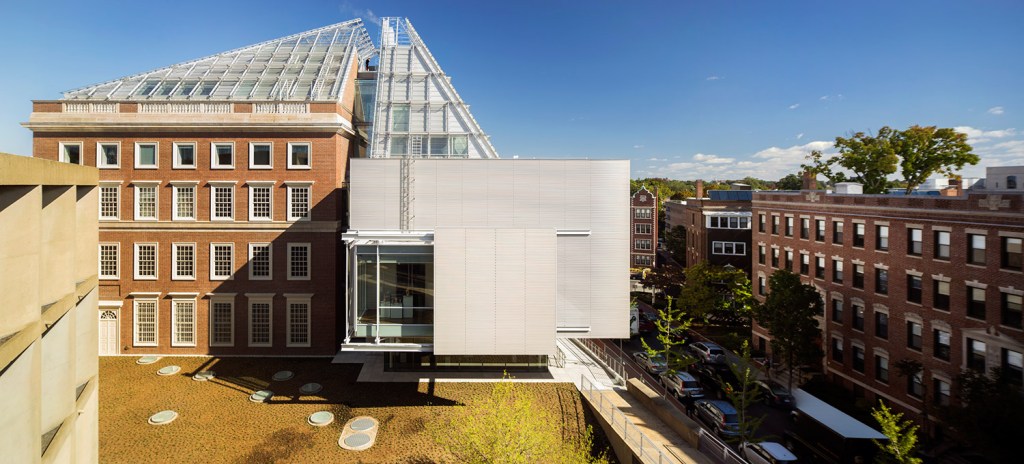
I was reminded of the efficiency of the Bowdoin solution when I visited the Harvard Art Museums, after it reopened last November renovated and expanded by Renzo Piano Building Workshop. The Harvard Art Museums combined the Fogg Museum, the Busch-Reisinger Museum and the Arthur M. Sackler Museum under a single roof in a facility about the size of the Colby College Museum of Art. (Harvard has 43,000 square feet of exhibition space and Colby 38,000, but Colby has more open spaces and soaring ceilings.) Piano unquestionably is one of the world’s leading architects, particularly for art spaces. Because of his work at McKim’s Morgan Library and Museum and at the Art Institute of Chicago, Piano had been my hope for Bowdoin. But having visited the Harvard space, I see Bowdoin got it right.
Harvard’s new space certainly is elegant, but instead of breathing, it may be hyperventilating – with a price tag of $350 million.
The building is a slick box with a couple of misfit Louvre pyramid halves sitting on it to play the part of an overpriced skylight. In fairness, Harvard’s most egregious problem might be that the curators overstuffed the (older) modernist galleries with far too much art, but if you’re going to put a building next to the Carpenter Center for the Arts, a masterpiece as well as Le Corbusier’s only building in America, you need to think about the street-level sculptural presence of the architecture as well as its interior functions.
Piano’s exterior tries to be elegantly reductive with its flat curtain walls but is instead fussy, thin and precious. While Piano didn’t pull it off, Frederick Fisher certainly made it work with Colby’s new Alfond-Lunder Family Pavilion, a slick glass curtain-wall box that fits beautifully into a stately brick academic campus.
The pavilion not only gets the museum and academic jobs done, but it adds a sophisticated, splashy and much-needed public welcoming point to the campus. Colby is gorgeous but suffers from the ivory-tower-on-the-hill effect of its over-dressed Georgian architecture. At $15 million for a 26,000-square-foot building, the pavilion now seems an incredible bargain for a handsome structure that so elegantly knits together the museum’s various spaces, including the school’s best building, Fisher’s Lunder Wing, and its ugliest, the hanger-like Paul J. Schupf Wing.
I was looking forward to Colby’s latest gallery installations to see if the curatorial staff had new ideas about their newish space. The first post-renovation major exhibition was Bernard Langlais; while it was an excellent show, it’s not particularly friendly work for architecture.
Throughout the vast and ranging spaces, the galleries look great, particularly the contemporary gallery on the first floor with a newly added Joan Mitchell painting that alone is worth the trip. The most impressive space at the moment, however, is the entrance gallery. Large, airy and spare, the space features well-designed and inviting couches, excellent windows and a view across the open welcome desk area. Despite having no shortage of excellent wall space, it features just a few elegant works by Robert Mangold, Sherrie Levine, John Chamberlain and Dan Flavin.
The gallery also features three stacks of prints by Félix González-Torres that may be the most exciting work now on view in the region. González-Torres was a rising international art star when he passed away in 1996 at the age of 38. What is intriguing and provocative about these three works is that anyone can take a print from each stack. Two are large, white sheets that read, “Nowhere better than this place,” and, “Somewhere better than this place.” The third features a grainy and pensively grayish sky that is empty save for a soaring gull seen at a distance.
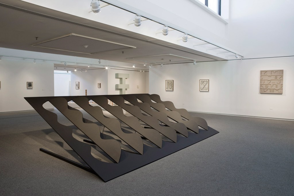
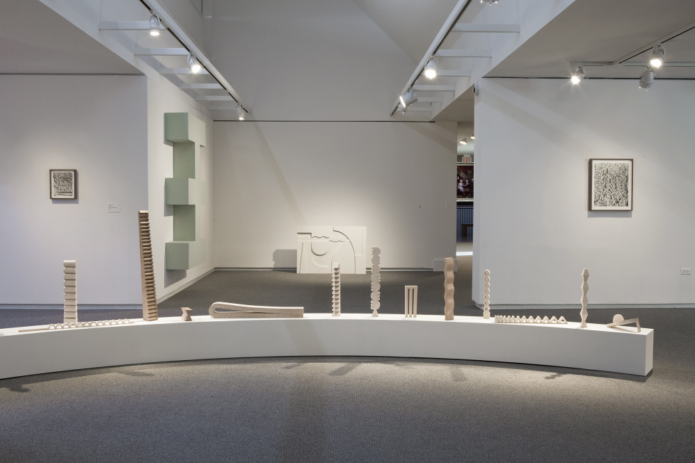
The center gallery exhibition features the work of emerging Portland artist Elizabeth Atterbury. Considering the heft of Colby’s collection (not quite Yale or Harvard, but it surpasses both in American art and it belongs on the short list with them in discussions of America’s top university art museums), this says something extraordinary about Colby’s commitment to Maine.
The Atterbury show is so savvy, handsome and engaging that it comes as a surprise to learn the artist is so new to the scene. Her work features formalism-oriented geometrical constructions and photographs of similar systems made in sand or other materials. Her work, along with the accompanying Terry Winters show, merits a much closer look in a future column.
With massive new art spaces coming with a planned expansion at the Portland Museum of Art and the Center for Maine Contemporary Art’s forthcoming new building by the talented architect Toshiko Mori, we not only have much to see now in Maine, but much to look forward to as well.
Freelance writer Daniel Kany is an art historian who lives in Cumberland. He can be contacted at:
dankany@gmail.com
Send questions/comments to the editors.


Comments are no longer available on this story